TLDR: this is a slightly longer piece as it includes a fair bit of detail for those wanting to dig deeper on Pop-Ups. If you have a simple question, please just ask! ;o)
Let’s assume you don’t want your website being super annoying to users. You don’t want to be “that guy” that everyone wants to avoid. Popping up in the middle of a conversation trying to sell you something you don’t even want!
But at the same time, pop-ups are very effective as capturing new prospect details at key moments during a user visiting your website.
Read on to learn when and how you might best utilise website pop-ups effectively for your website to achieve your business goals without upsetting your current customers or turning off prospective customers.
Great pop-ups should increase conversion rates to enquiry, increase sales and ensure website users are made aware of special offers, services or information to help them with the question they came to your website to answer.
Pop-ups are not all bad
82% of searches for pop-ups are to enable them!
We see search volumes for “pop-ups” are almost even in blocking pop-ups, or allowing them. There are many specific phrases as examples, but to give you a guide, if there are 1,000 searches for blocking pop-ups, there will be ~820 to enable pop-ups.
The following chart shows the relative volumes of user searches when it comes to pop-ups, you can see the stop and enable are about equal, and some brands and devices also feature.

There is quite a range of topics like enabling popups on iphone, stop mcafee popups on chrome, etc. And we have to think McAfee don’t have their pop-up right, as the search volume for this is huge! They come pre-installed on a lot of Windows computers I guess, and if they don’t get the user upfront, they lose them. But it can’t be a positive brand experience! (just our 2 cents worth)
Let’s start at the beginning: What is a pop-up?
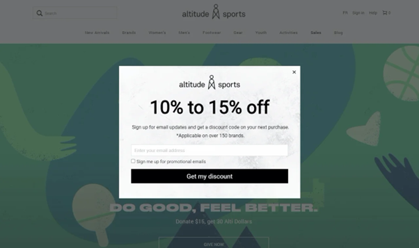
A pop-up is a form of web advertising that appears while browsing a website, usually in the form of a small window that covers the rest of the content on the page until the user dismisses it.

Pop-ups are an effective means of directing traffic towards various products and services offered by your business. They can showcase aspects of your business and serve as useful prompts for customers.
But when pop-ups are used poorly, they can be unappealing and even frustrating for users. And it isn’t just human users, we also need to be aware of Google’s policy regarding pop-ups. We want to make sure you avoid the common mistakes publishers make in developing a pop-up and make sure the marketer in you has the top tips for getting pop-ups right.
Common Mistakes in Pop-ups
Imagine you’ve clicked onto a site and before you have read anything a box appears over the content, about something that’s irrelevant to your search, and there’s no obvious means of closing it, or you close it and moments later it appears again!
You have been subjected to a disruptive or abusive pop-up; one that interferes with the browsing experience and could potentially drive-away the customer. The other commonly undesirable traits to look out for in managing pop-ups include:
- Ads that initiate downloads without the user being in control
- Contain abusive content (visuals, language, viruses etc)
- Change user preferences
- Interfere with the user experience
Pro Tip; We want to reiterate this last point! When adding pop-ups you must keep in mind your EXISTING CUSTOMERS. If they come to your website regularly to order products or pay your bill, they are likely to be the ones subjected to your pop-ups the most.
Make sure you limit the number of times a pop-up appears to each user. If your pop-up tool does not allow this, you need to find one that does!
A WORD FROM GOOGLE… (KIND OF IMPORTANT!)
Google penalises websites that contain pop-ups with those undesirable traits by lowering their ranking on the search results page, so keep both the customer and Google’s Ad Placement Policy in mind when developing your pop-ups to avoid getting the side-eye from Google and hurting your search ranking results!
6 Tips for a Good Pop-up Experience on Your Website
Good pop-up tools possess several key attributes that contribute to their effectiveness.
- Value Proposition: Effective pop-ups should offer something valuable to the user that is worth pulling their attention from the content on your site. Whether it’s discounts, exclusive content, or access to useful resources, make sure the offer is enticing enough to deem the use of a pop-up.
Pop-ups should avoid containing generalised statements such as “Buy our products”, this can be seen as aggressive and simply unnecessary. Remember; they’re on your site because they’re already interested in your offerings. Perhaps Learn More works better, but trial and error is your friend here. - Timing: The timing and frequency of pop-ups are vital to the user’s experience, compliance with Google’s Ad Policy and the overall success of the ad. Pop-ups are triggered by a variety of factors which you can determine/alter to make the user experience easy, organic, and efficient. Common triggers include:
- Time-based triggers: Pop-ups can be set to appear after a specific amount of time has elapsed since the user landed on a page. For example, a pop-up might appear after 30 seconds or 1 minute of browsing.
- Scroll-based triggers: Pop-ups can be triggered based on how far down the user has scrolled on a page. For instance, a pop-up might appear when a user reaches the bottom of an article or when they scroll past a certain percentage of the page.
- User Behaviour triggers: Pop-ups can be triggered based on the user’s behaviour on the site, such as their previous interactions, browsing history, or geographic location.
- Exit-Intent triggers: These triggers detect when a user is about to leave the website, often indicated by mouse movement toward the browser’s navigation bar or closing button. When exit intent is detected, a pop-up can appear to try to retain the user’s attention.
- Frequency: Be mindful of how often your pop-ups appear to users. Too many pop-ups can quickly become annoying and abusive, leading to a negative user experience, especially for regular customers who frequent the site. Putting systems in place to avoid repeating pop-ups, such as limiting the number of pop-ups per session or implementing cookies to remember when a user has already interacted with a specific pop-up, can help mitigate frustration and enhance user satisfaction. Striking the right balance ensures that pop-ups remain effective tools for engagement without detracting from the overall browsing experience.
- Relevance: Relevance is key when it comes to pop-ups. They should seamlessly integrate with the content on a page. If a pop-up appears for a sale on guitars when I am on a page about TV sets, the pop-up is irrelevant and merely interrupts my search. Users are far more likely to respond positively to advertisements that are closely related to their interests or needs. So carefully consider where your pop-up should be.
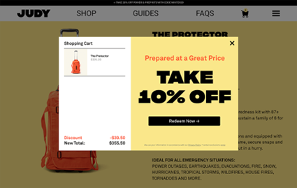
- Design and Copy: Your pop-up’s design and wording choices are pivotal for its success. Play with colour, size, and font. Keep it sleek, professional, and in line with your website’s aesthetic. Ensure your wording is concise, compelling, and prioritise clearly communicating the value proposition. The design should clearly illustrate the value of the offer being made by the pop-up. The value should be the centrepiece of the ad. For example, this pop-up by ‘Judy’:

This pop-up’s colours and fonts are synonymous with the website/page it’s on. It also clearly states its value proposition in large, bold font, the call to action/button is directly below the value proposition, and the use of red is clever and effective in highlighting the discount’s benefits. - Mobile Optimization: With the increasing use of mobile devices, it’s essential to ensure that your pop-ups are optimised for mobile users. Make sure they are mobile-responsive and don’t interfere with the user’s ability to navigate the site on smaller screens.
Choosing the Right Popup Plugin for Your WordPress Site
Now we have an idea of what will create an effective pop-up, we need to choosing the right popup plugin if using a WordPress website. There are many popup plugins available, each offering different features and functionalities. It is important to choose a plugin that is compatible with your WordPress theme, easy to use, and offers the necessary customization options.
Consider the following factors when selecting a popup plugin:
- Compatibility with your WordPress theme
- Ease of use and user-friendly interface
- Customization options for designing attractive popups
- Integration with email marketing services
- Performance and loading speed of the plugin
Test and Test Some More: Analysing Data and A/B Testing for Popup Optimization
Once in place you will want to ensure that your popups are performing optimally. The best way to do this is to analyse data and conduct A/B testing to gain insights into user behaviour, conversion rates, and the effectiveness of your popups.
Consider the following steps for analysing data and conducting A/B testing for popup optimization:
- Track popup performance metrics such as conversion rate, bounce rate, and exit rate
- Use analytics tools to analyse user behaviour and identify areas for improvement
- Conduct A/B tests by creating variations of your popups and measuring their performance
- Test different designs, headlines, calls-to-action, and triggers to find the most effective combination
By continuously analysing data and conducting A/B testing, you can optimise your popups for better user engagement and conversion rates.
Pop-ups Should Deliver User Value
The development and implementation of an effective and engaging pop-up ad has to be thought out and sympathetic to the user’s experience. If we start with “How can I help my customer” as the first question we will be on the right track.
Then ensuring to adhere to Google’s Ad Placement Policy and considering factors like timing, frequency, relevance, and design, you can develop pop-ups that enrich user engagement and achieve your business objectives.
At Your Digital Solution, we specialise in all things web design and online marketing. Reach out to us today and see how we can transform your online presence, so you can get back to doing what you love. Enquire now and let’s make your digital dreams a reality!
We hope these tips help you breeze through the setup process and set your business up for digital success!


